Bitmap button control and toggle in SOLIDWORKS property Manager Page
This control allows to assign image onto the button or toggle
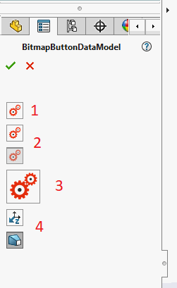
- Button with bitmap
- Checked and unchecked toggles with bitmap
- Large button
- Standard images in the buttons
Button
Decorate the property of type Action with Xarial.XCad.UI.PropertyPage.Attributes.BitmapButtonAttribute in order to create bitmap button control.
[BitmapButton(typeof(Resources), nameof(Resources.BitmapSample))]
public Action Button1 { get; set; } = new Action(()=> { });
Toggle
Decorate the property of type bool with Xarial.XCad.UI.PropertyPage.Attributes.BitmapButtonAttribute in order to create bitmap toggle control.
[BitmapButton(typeof(Resources), nameof(Resources.BitmapSample))]
public bool Toggle1 { get; set; } = false;

[BitmapButton(typeof(Resources), nameof(Resources.BitmapSample))]
public bool Toggle2 { get; set; } = true;
Size
Default size of the button is 24x24 pixels. Use the width and height parameters of the constructor to assign custom size.
[BitmapButton(typeof(Resources), nameof(Resources.BitmapSample), 48, 48)]
public Action Button2 { get; set; } = new Action(() => { });
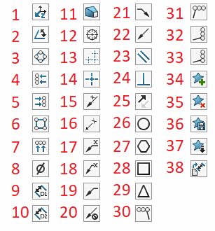
Standard
Use constructor overload to specify standard bitmap for the button.
[BitmapButton(Xarial.XCad.UI.PropertyPage.Enums.BitmapButtonLabelType_e.AlongZ)]
public bool Standard1 { get; set; }

[BitmapButton(Xarial.XCad.UI.PropertyPage.Enums.BitmapButtonLabelType_e.Draft)]
public bool Standard2 { get; set; }
- AlongZ
- Angle
- AutoBalCircular
- AutoBalLeft
- AutoBalRight
- AutoBalSquare
- AutoBalTop
- Diameter
- Distance1
- Distance2
- Draft
- DveButCmarkBolt
- DveButCmarkLinear
- DveButCmarkSingle
- LeaderAngAbove
- LeaderAngBeside
- LeaderHorAbove
- LeaderHorBeside
- LeaderLeft
- LeaderNo
- LeaderRight
- LeaderYes
- Parallel
- Perpendicular
- ReverseDirection
- RevisionCircle
- RevisionHexagon
- RevisionSquare
- RevisionTriangle
- StackLeft
- StackRight
- StackUp
- Stack
- FavoriteAdd
- favoriteDelete
- FavoriteSave
- FavoriteLoad
- DimensionSetDefaultAttributes